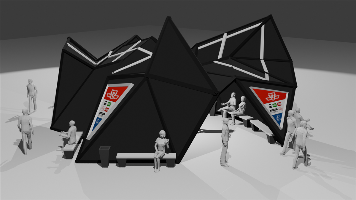
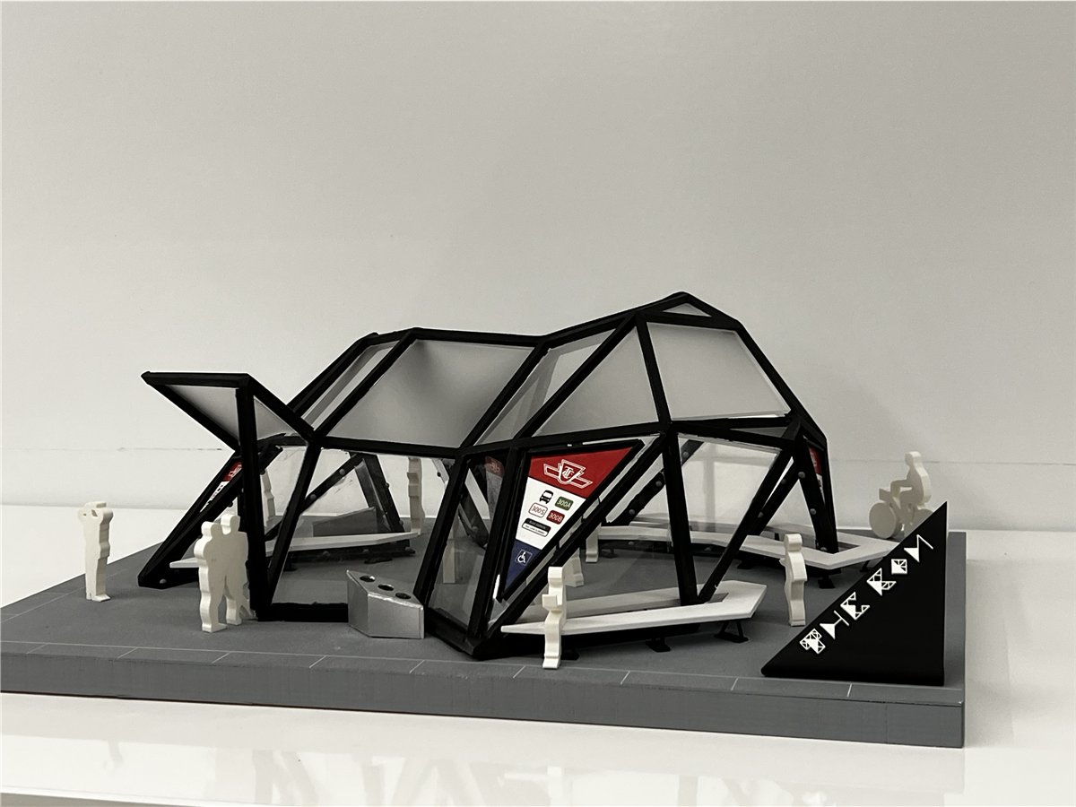
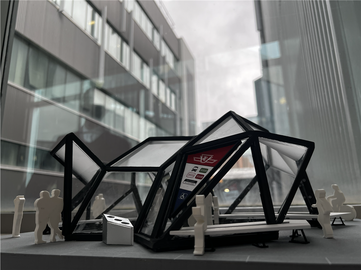
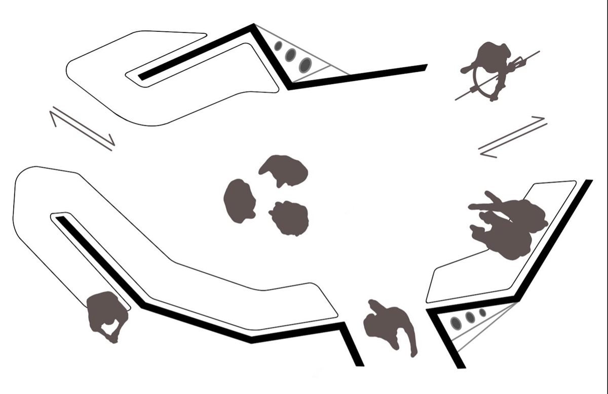
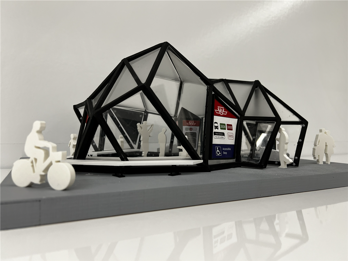
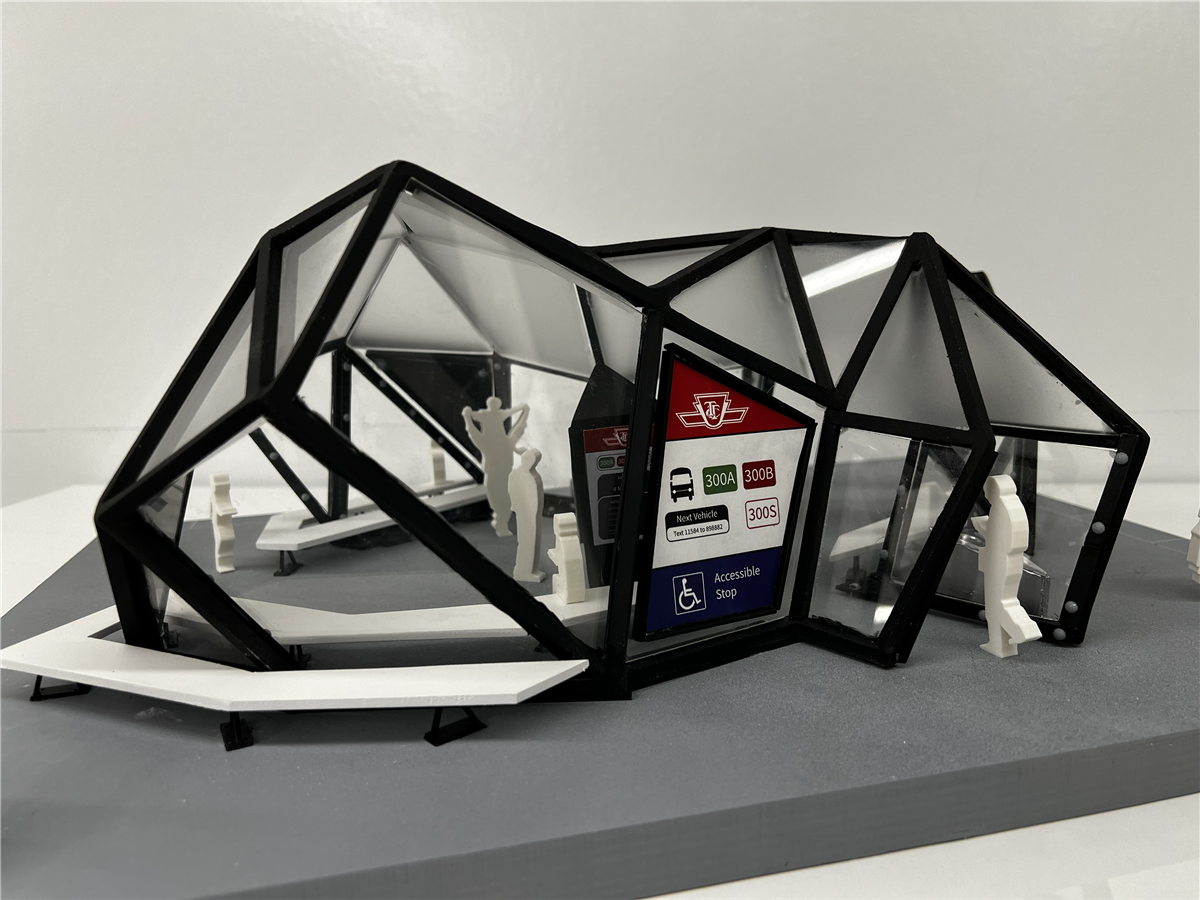
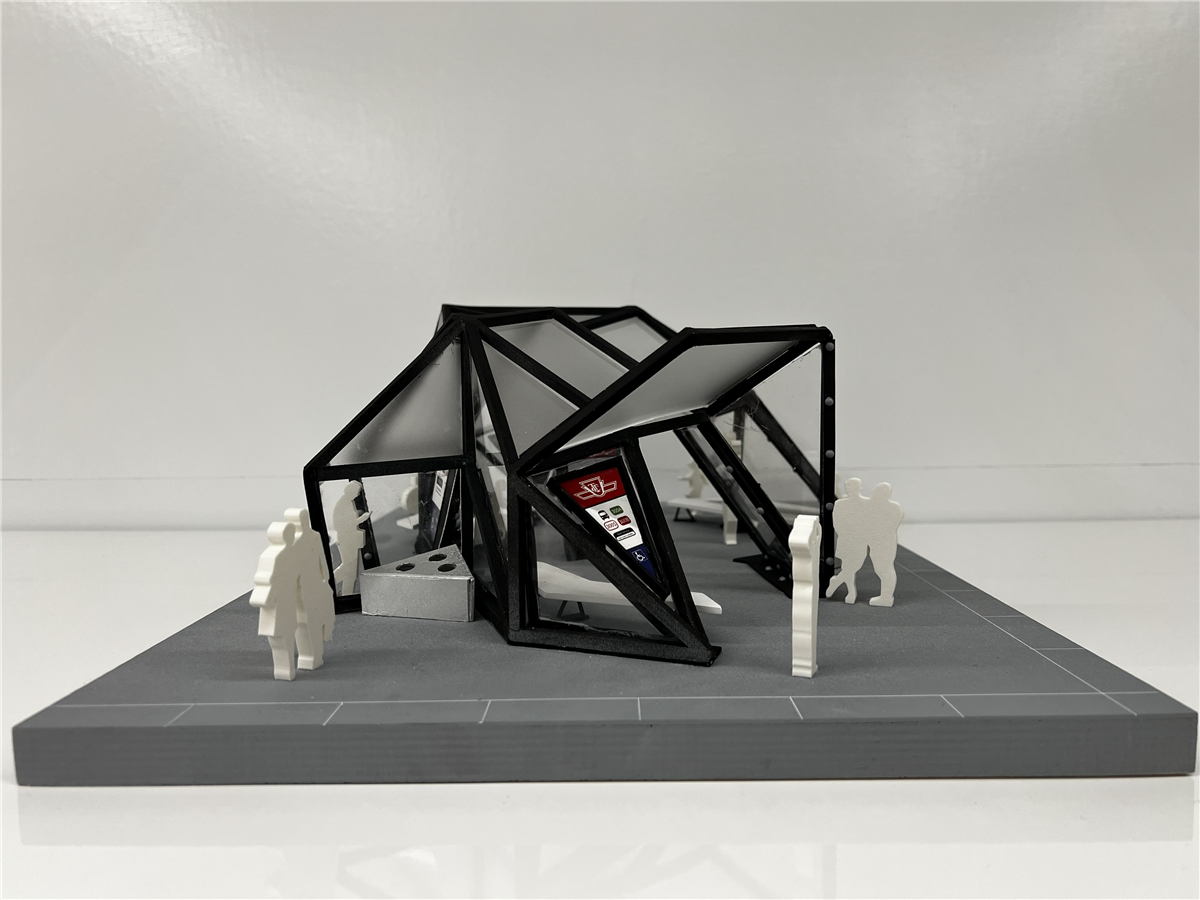
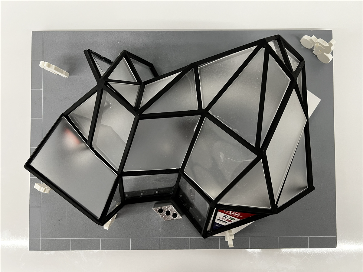
BUS STOP

Hand made


Rendered using

Overview

The Crystal Bus Stop is a conceptual architectural project designed to modernize Toronto's transit landscape. Inspired by the deconstructivist Crystal addition to the Royal Ontario Museum, this bus stop moves away from standard utilitarian shelters in favor of a bold, sculptural form. The design utilizes aggressive angles and a monochromatic black-and-white palette to create a landmark structure. It serves as both a functional transit point and a piece of public art.

Crystal bus stop exterior view
Crystal bus stop interior perspective

Fractured Geometry

Directly references the ROM's crystal architecture with intersecting triangular planes, creating a unique interior volume that breaks traditional horizontal shelter lines.

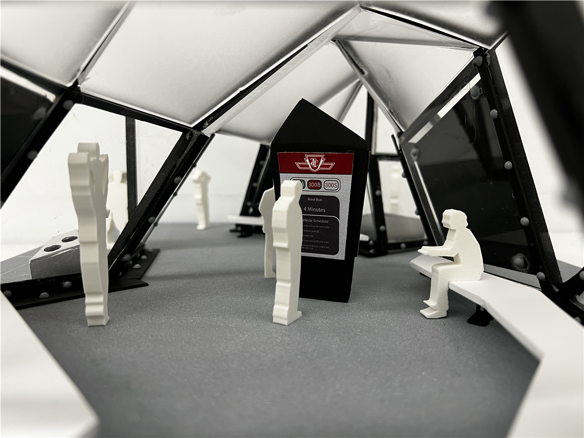
Integrated Wayfinding

Features high-contrast, triangular information kiosks that house real-time vehicle schedules, route maps, and accessibility status using the iconic TTC branding.

Social Environment

Includes integrated crystal benches designed to provide seating while maintaining the structure's sharp, geometric aesthetic.

Transparency & Light

Utilizes white light-strips along the fault lines of the structure to provide visibility and security for commuters during evening hours. This illumination emphasizes the "fractured" edges of the geometry at night, transforming the functional transit stop into a glowing urban sculpture.

Crystal bus stop model view one
Crystal bus stop model view two

The Design Challenge

The primary challenge was balancing art and utility. A shelter inspired by deconstructivism risks being difficult for commuters to navigate or prioritize clear information delivery.

Bus stop challenge render one
Bus stop challenge render two

The Solution:

  • Zoned Navigation: The structure is divided into distinct pockets for seating and hubs for information. By placing TTC kiosks at high-visibility entrance points, commuters can check key status without disrupting seated passengers.

  • Brutalist Branding: The use of the red-and-white TTC logo against the sharp black structure provides an immediate visual anchor, ensuring the building is instantly recognizable as a transit stop despite its unconventional shape.
Bus stop circulation and plan study

Reflections

The Crystal Bus Stop proves that city infrastructure can be a site for architectural expression. By translating the visual language of one of Toronto's most famous landmarks into a functional street asset, the project enhances the sense of place for both locals and visitors. It showcases an ability to handle complex 3D forms while maintaining strict adherence to the functional requirements of public transit.