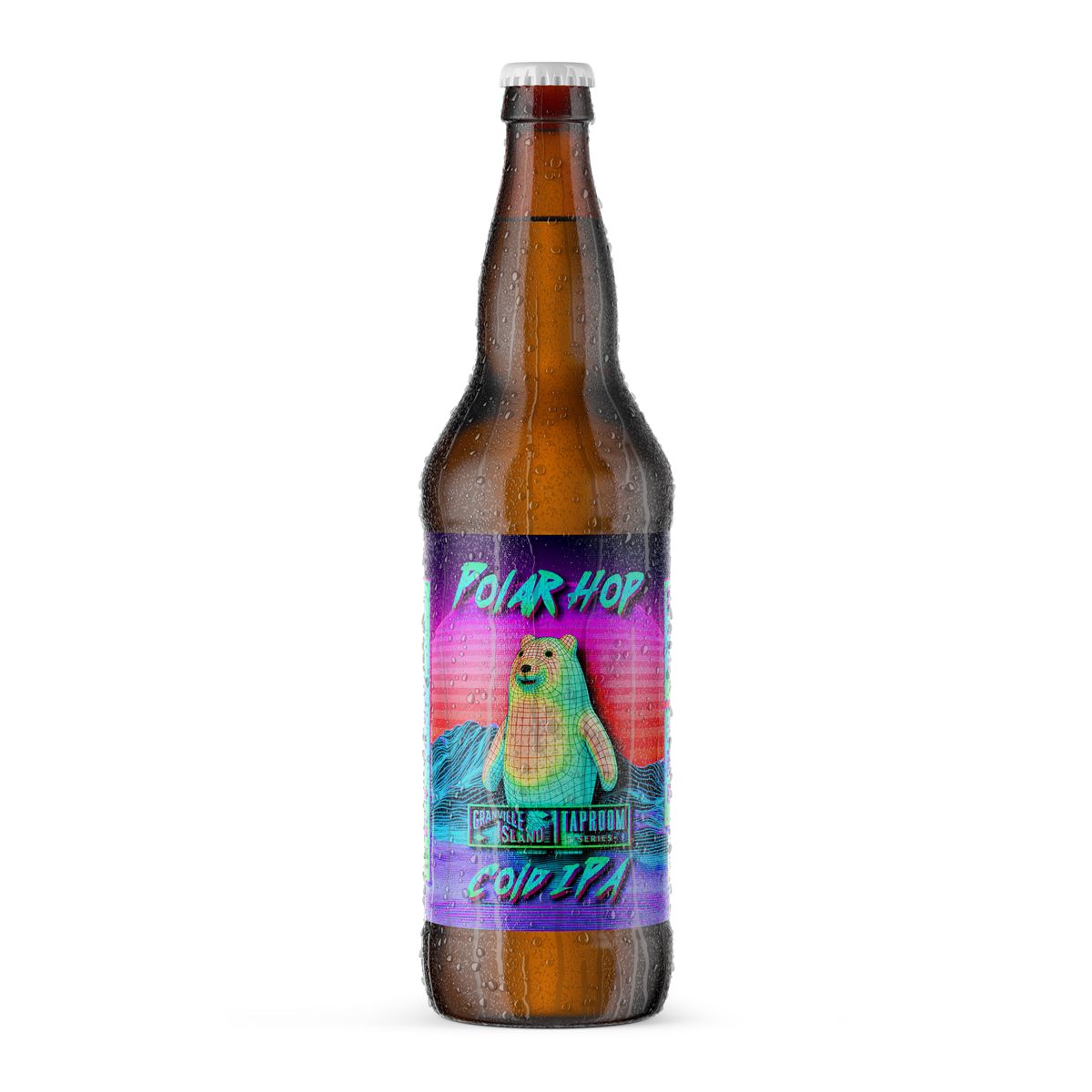
POLAR HOP
Made using ![]()
Overview
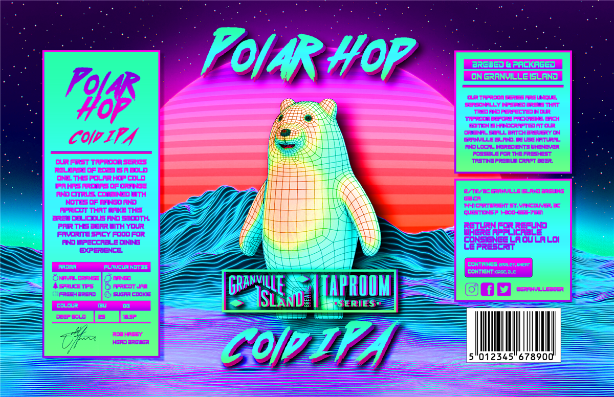
Polar Hop IPA is a vibrant, rave-inspired beverage packaging project that marked my professional transition into client-based work. The goal was to create a "shelf-popping" label that synthesized the raw power of the Arctic with the high-energy aesthetic of modern nightlife. By moving through a rigorous iterative process from minimalist charcoal sketches to neon-saturated digital illustrations, the final label captures a unique "Ice & Neon" atmosphere designed for maximum visual impact.
Core Pillars & Elements
Concept (AI-Assisted)
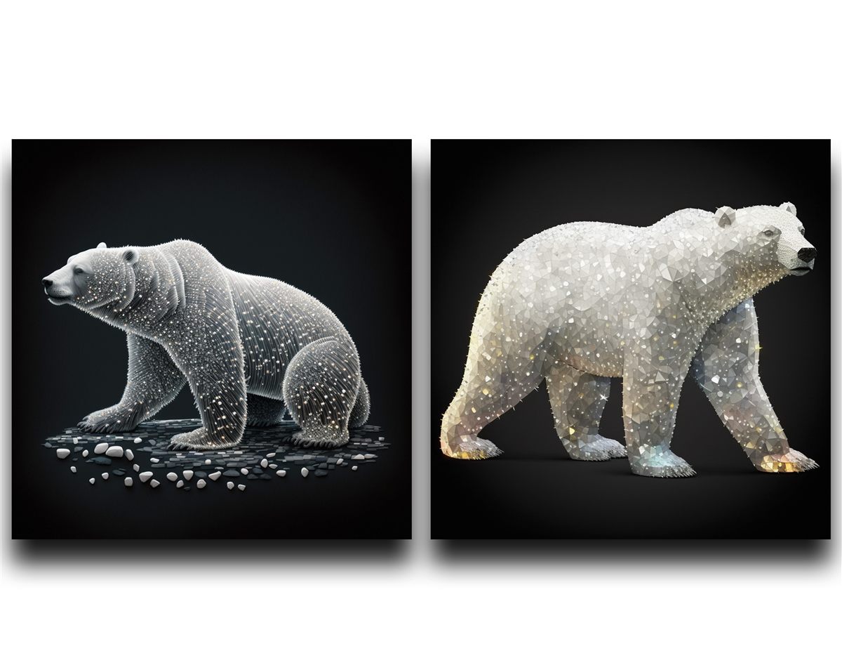
Curated mood boards using AI tools to explore two polar extremes: a "Crystallized" prismatic bear and a "Rugged Fissure" minimalist bear.
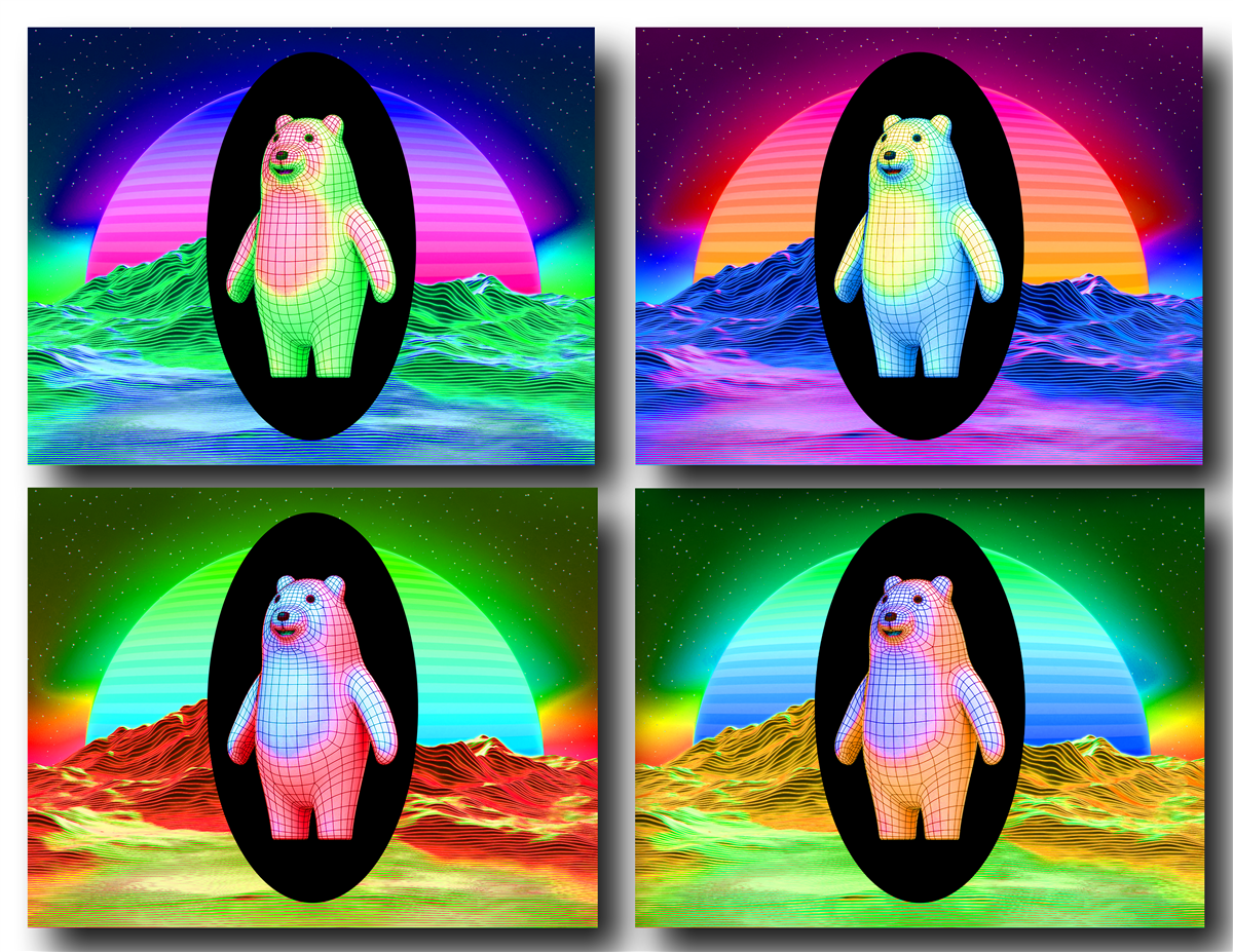
Vibe (Rave-Style)
Transitioned to a high-chroma palette featuring neon greens, blues, and purples to align with a high-energy, contemporary audience.
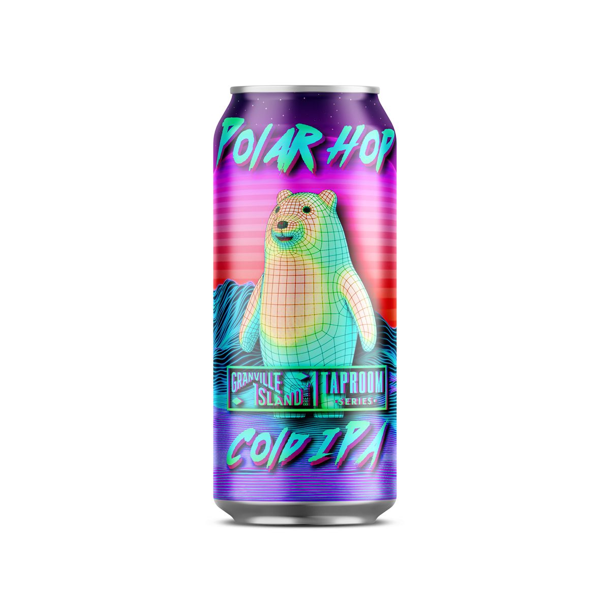
Final Asset
A distinct polar bear silhouette featuring intricate textured line-work, set against a glowing neon sunset backdrop.
The Design Challenge
The primary challenge was Shelf Differentiation. In a saturated craft beer market, a minimalist or black-and-white design risked being overlooked. The project required a pivot from "subtle and artistic" to "vibrant and aggressive."
The Solution:
- Visual Evolution: I abandoned the initial low-contrast sketches in favor of a "Rave-Style" design. This incorporated glowing outlines and textured "ice fissures" that were reinterpreted as neon light-streaks.
- Color Theory: By utilizing a triadic neon scheme against a dark background, the label creates a natural focal point on the bear, ensuring the brand is recognizable even in low-light environments like bars or events.
Reflections
Polar Hop IPA represents the importance of being adaptable. The willingness to abandon an initial "minimalist" vision in favor of a "vibrant" one was the key to fulfilling the client's need for a product that stands out. It serves as a testament to my ability to balance artistic experimentation with commercial viability.