NEIGHBOURHOOD
Made using ![]()
Overview
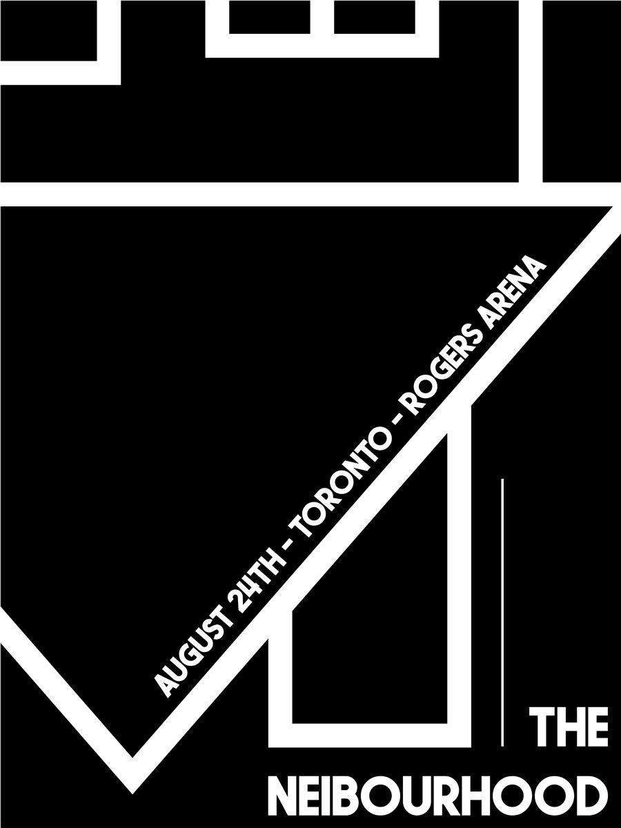
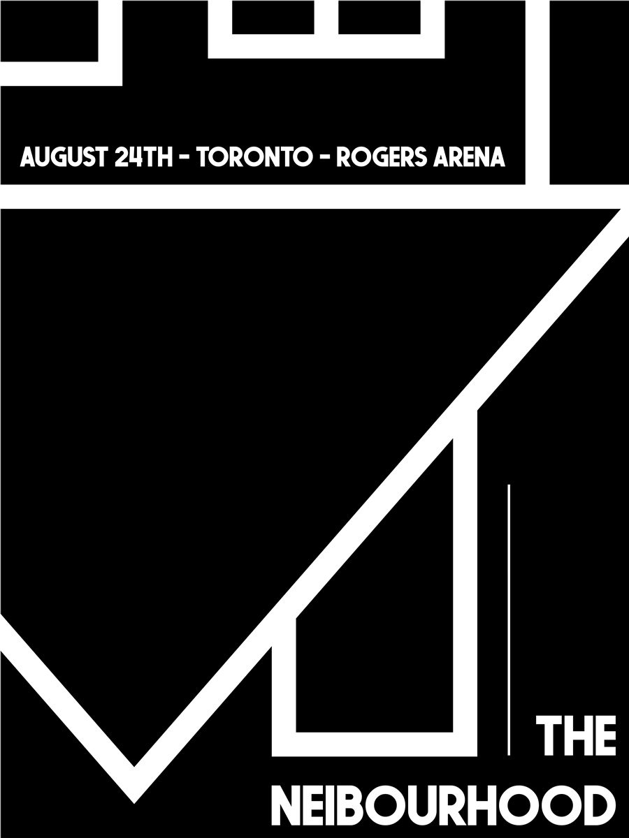
This conceptual tour poster for the band The Neighbourhood is an exercise in monochrome geometric abstraction. Designed for their Toronto stop at Rogers Arena, the piece moves away from traditional band photography in favor of a Brutalist architecture-inspired layout. By deconstructing the band's iconic upside-down house logo and integrating it into a complex grid of intersecting diagonals, the poster captures the sharp, moody, and atmospheric aesthetic synonymous with the band's visual identity.
Core Pillars & Elements
Monochrome Palette
A strict adherence to black, white, and grayscale to mirror the band's signature high-contrast "noir" branding.
Geometric Fracture
Utilizing sharp, diagonal lines and varying stroke weights to create a sense of depth and architectural movement across the frame.
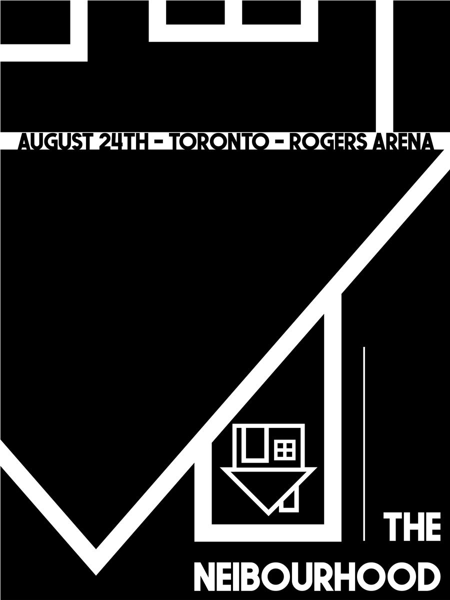
Logo Integration
The "upside-down house" is treated as a structural element rather than a static badge, anchoring the central vertical column.
Dynamic Typography
The tour details are set on a 45-degree angle, slicing through the composition to guide the eye from the date to the venue location.
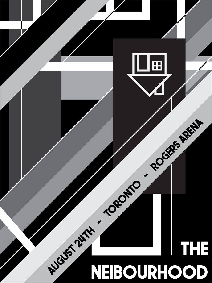
The Design Challenge
The primary challenge was Visual Balance in a complex environment. With so many intersecting lines and contrasting shapes, there was a risk of the primary information (the band name and date) becoming lost in the "noise" of the background.
The Solution:
- Negative Space Utilization: I used solid black and white blocks at the bottom right and top right to provide "resting points" for the eye, ensuring the band's name and the logo remain legible.
- Typographic Weight: By using a bold, sans-serif typeface for the main header, the text is able to punch through the busy geometric background without requiring a drop shadow or border.
Reflections
This poster serves as a bridge between graphic design and architectural drafting. It proves that a minimalist color palette does not have to mean a minimalist composition; through the use of complex geometry, the design achieves a maximalist sense of energy that fits the scale of an arena performance.