CASIO
Made using ![]()
![]()
Overview
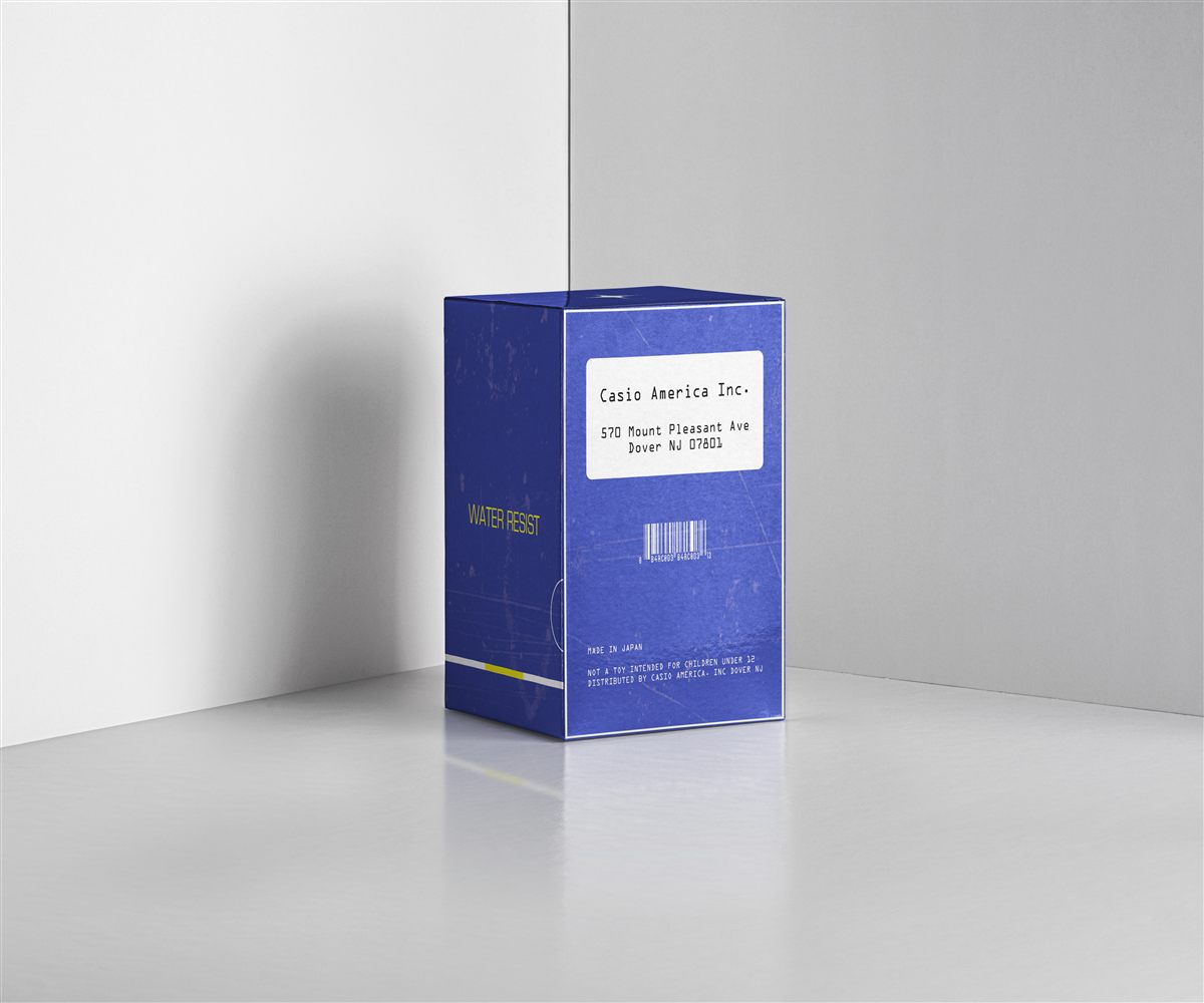
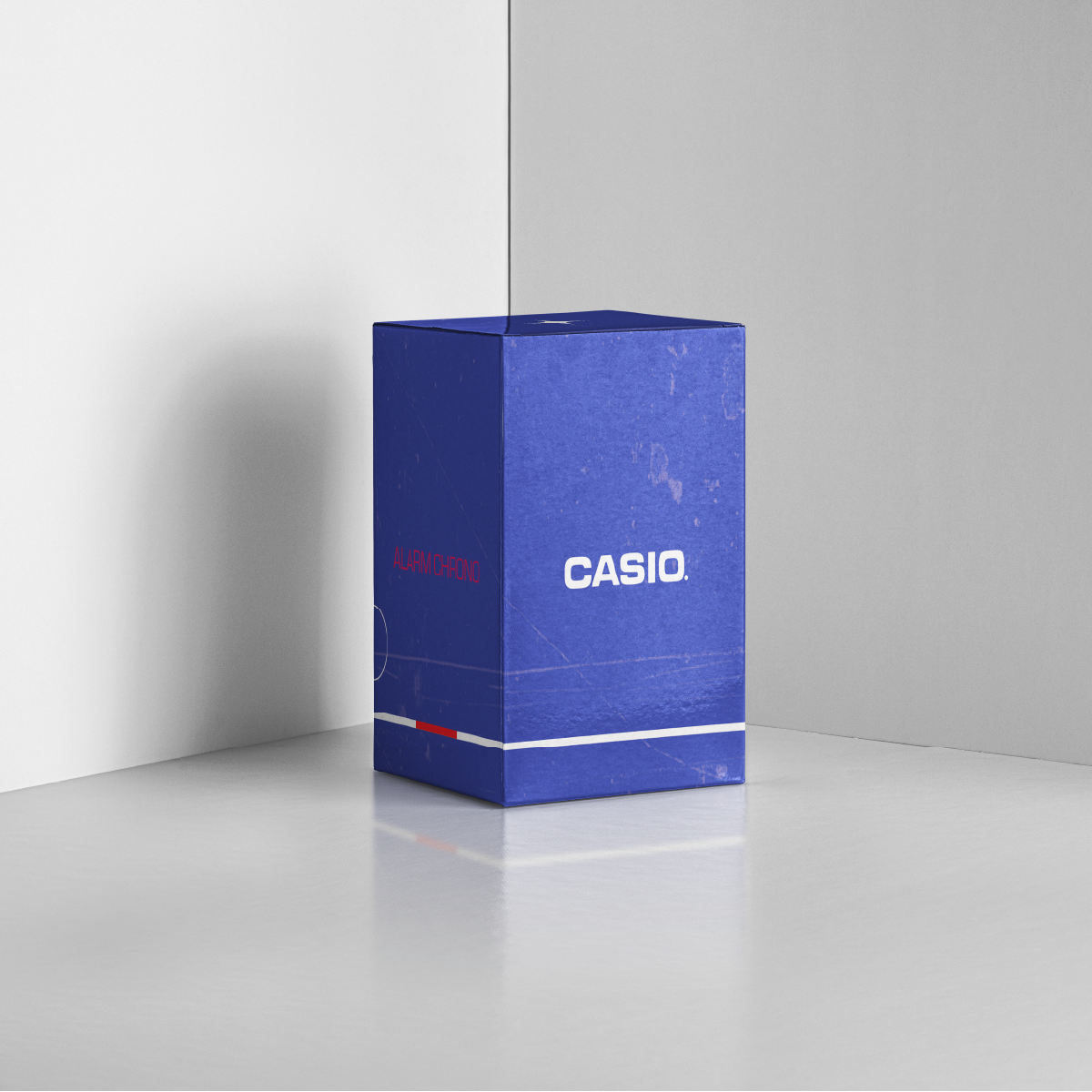
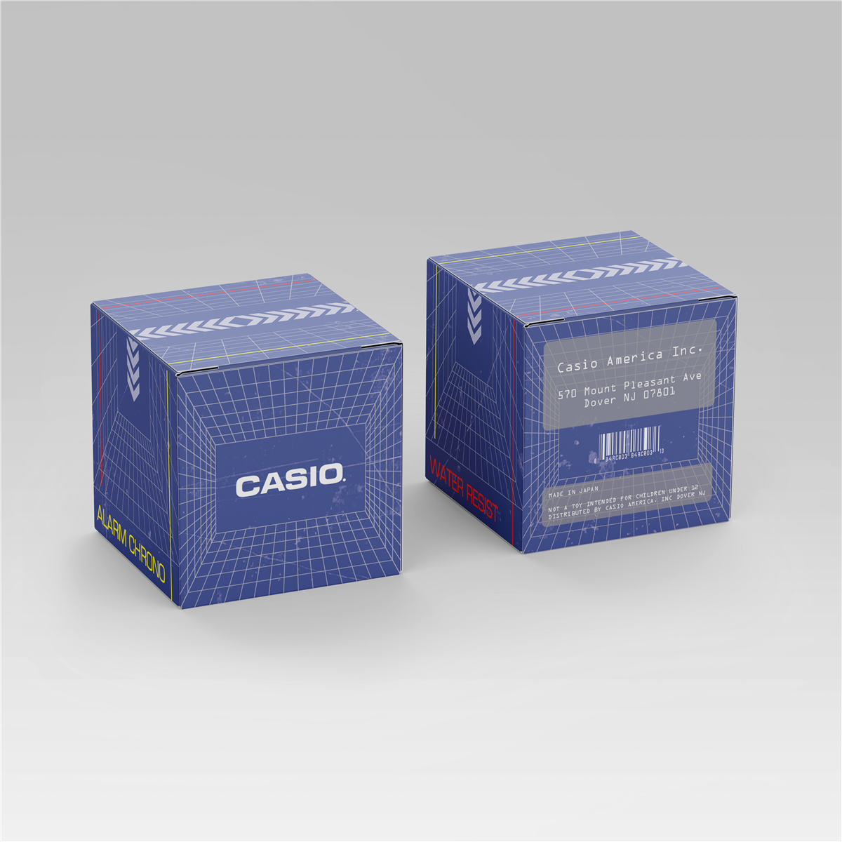
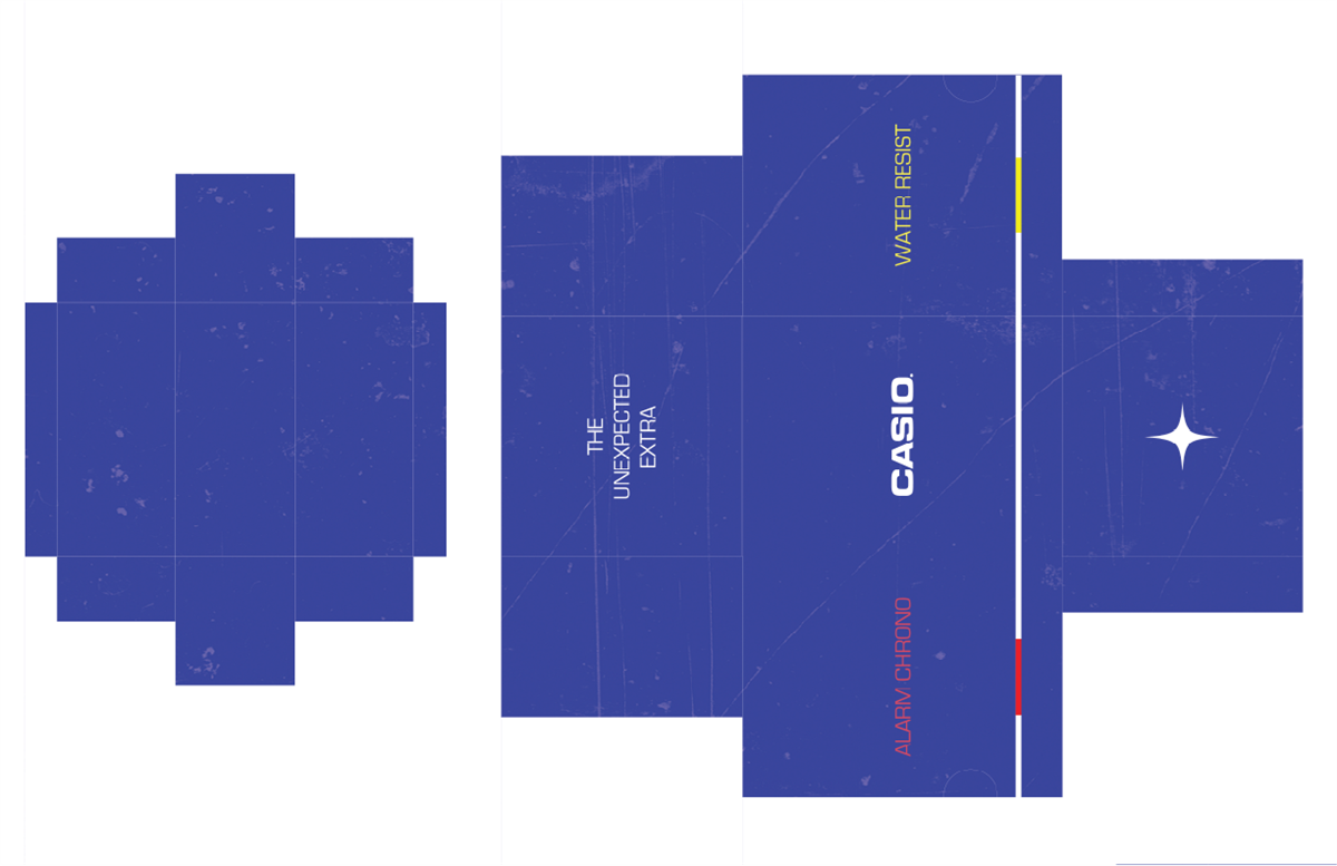
The Casio Packaging Concept is a series of industrial-inspired product box mockups that explore the aesthetics of early digital technology and laboratory equipment. Taking inspiration from the iconic Casio branding of the 1980s and 90s, the design incorporates a duotone "International Blue" stark white, paired with technical monospaced typography. The design language emphasizes materiality and tactile surfaces, transforming ordinary packaging into a "Water Resistant" and "Alarm Chrono" equipment module.
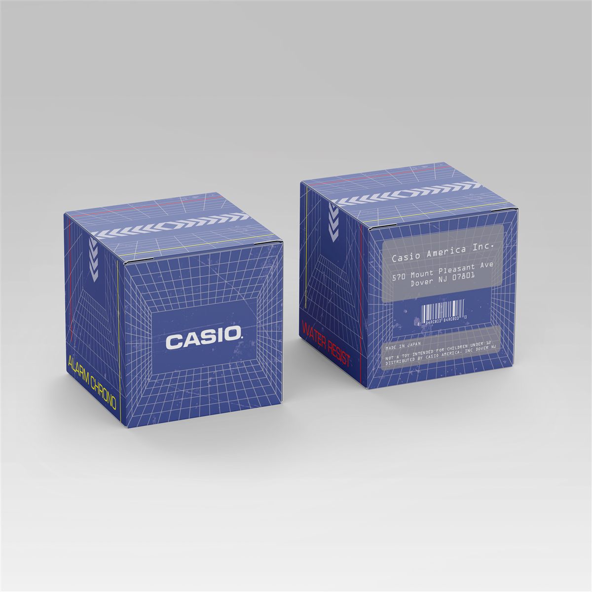
Industrial Grid
Utilizes a complex 3D isometric grid to enhance the feeling of early computer-aided design and futuristic virtual reality.
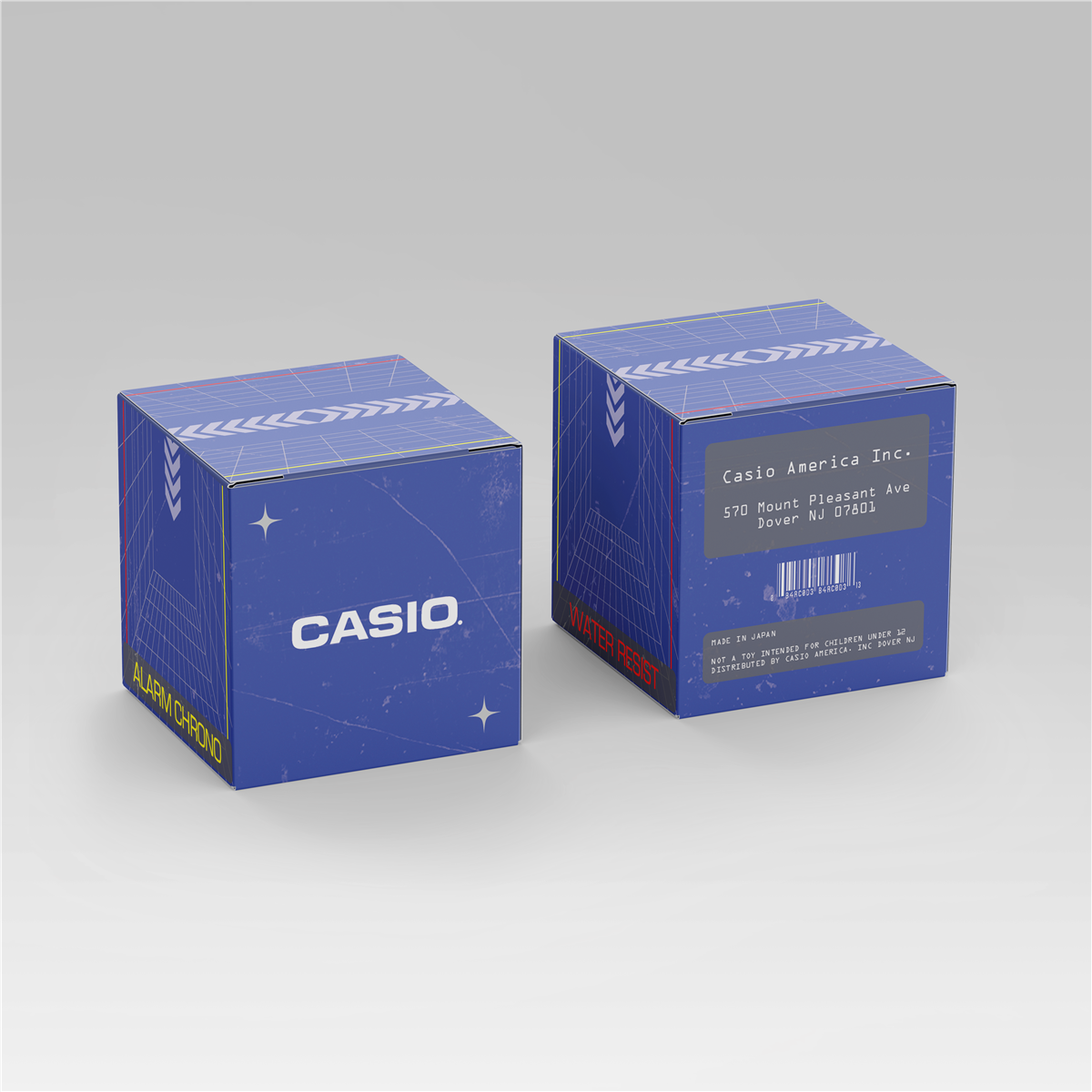
Celestial Minimal
Blends clean typographic layouts with subtle celestial icons, referencing The "Future-Ready" Casio Collections.
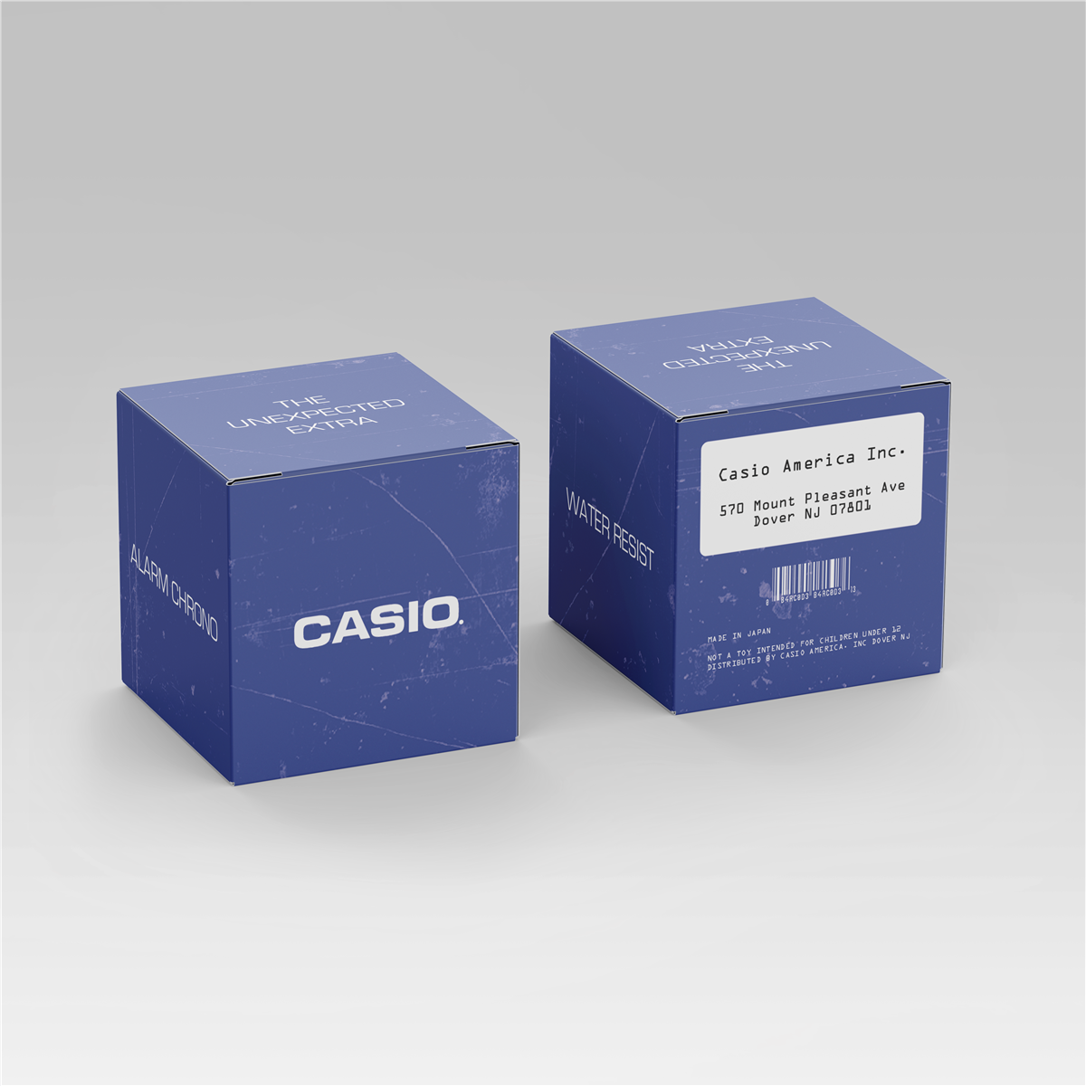
Utilitarian Mono
Focuses on extreme minimalism, prioritizing chopping-style slab blocks and barcodes to make the design feel like warehouse equipment.
Vertical Alignment
A study in shelf-presence, using bold vertical typography to maximize the impact of the Casio packaging on shelf equipment-box form factors.
The Design Challenge
The primary challenge was Authentic Subversion. I wanted to pay homage to the original Casio brand identity while modernizing the layout with contemporary "Brutalist" design elements.
The Solution:
- Tactile Distress: I applied a custom "weathered" texture to the digital mockups, simulating the scratches and scuffs of high-impact cardboard to give the design a tangible, "lived-in" history.
- Typographic Contrast: By mixing a classic bold sans-serif font with a delicate, monospaced "dot-matrix" address label, I created a visual hierarchy that feels both authoritative and technically precise.
Reflections
This project demonstrates my ability to take a legacy brand and re-interpret it through the lens of Retro-Futurism. It showcases a strong portfolio piece for anyone looking to bridge the gap between vintage tech culture and modern design sensibilities. It evokes a strong sense of reliability and emotional, giving it a comprehensive historical-archival quality in retro product packaging.